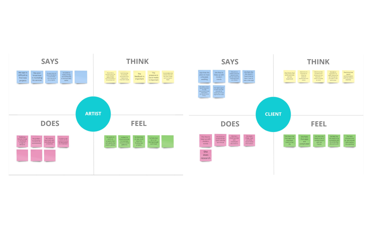
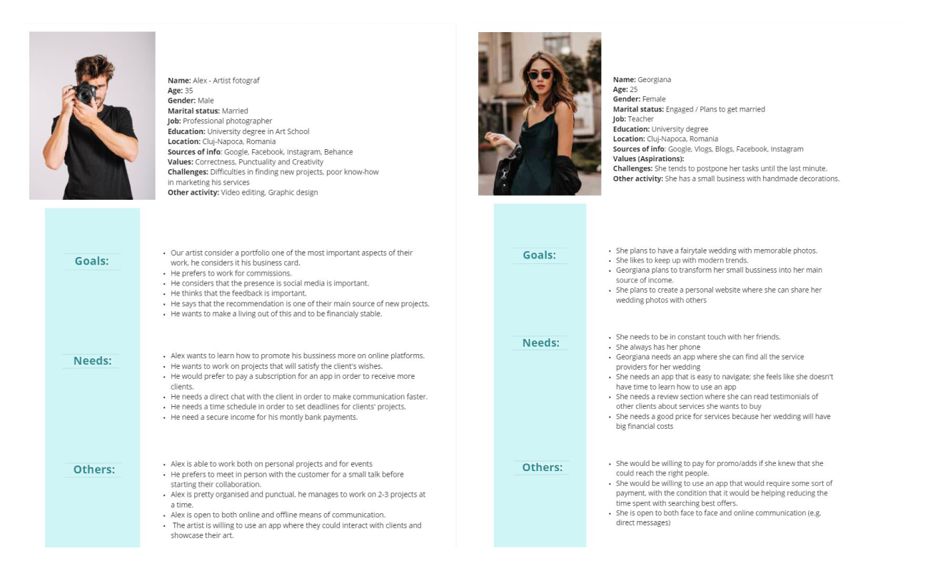
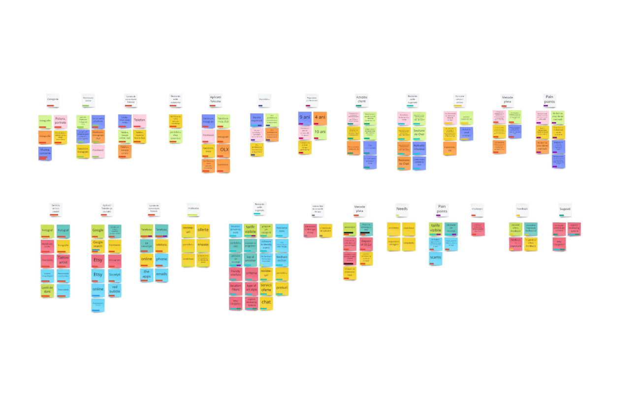
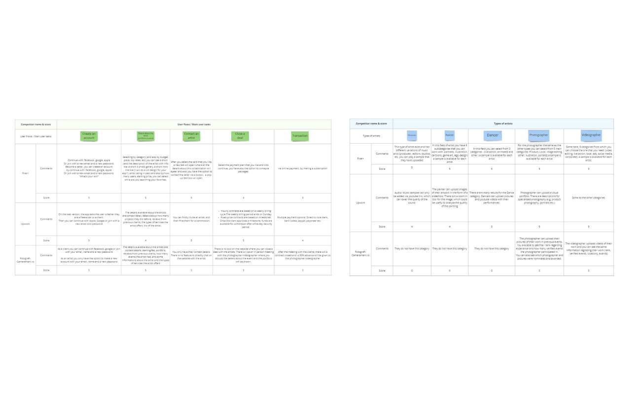
The main challenge was to uncover the artist and client's pains and imagine a digital product that responds to the artist's need for a place to present their work, in a standard way, while also helping the user with an easy-to-use digital product’’ I decided to start by doing a research in order to understand the users, this help me understand the problem I am trying to solve and the user’s needs, behaviors and the context in which they will use this product. The qualitative research part was conducted for both artist's and client's, under the form of interviews, to uncover the major pain points of the artistic service industry. For the quantitative research part, I’ve sent out forms to have as much information as possible collected in empathy map, personas and affinity diagram I have also made competitive research by analyzing other apps that are currently providing artistic services on the market.
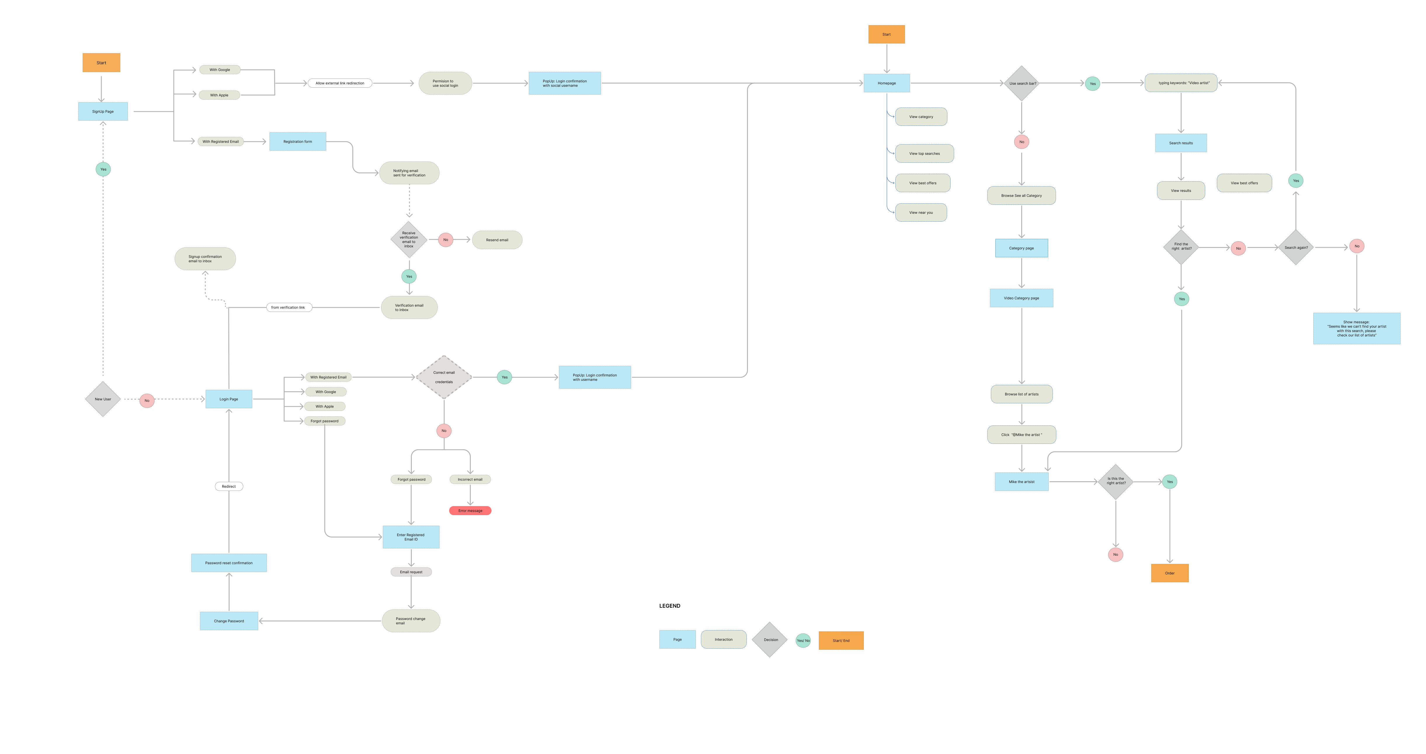
Based on the personas defined, a set of features was created in conjunction with the needs and pain points identified. Further, the features were structured in a user flow diagram to help create a prototype of a minimum viable product.
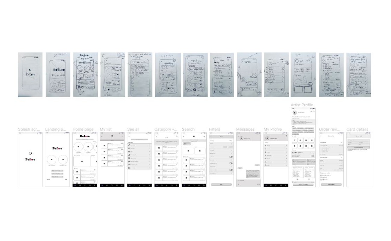
With the user flow in mind, I started creating the screens using pen and paper, at first, to better conceptualize the app. Further, a mid-fidelity prototype was generated to help conduct usability testing.
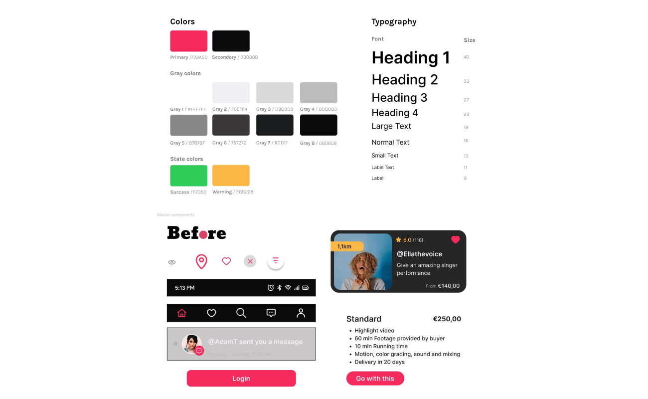
After all the usability testing results, a style guide was conceived to have consistency in the overall design. I’ve defined the UI colors, components, atoms, molecules, organisms, templates, and screens.
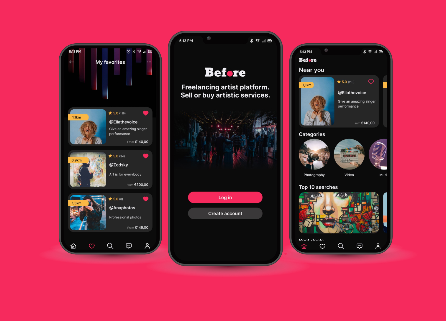
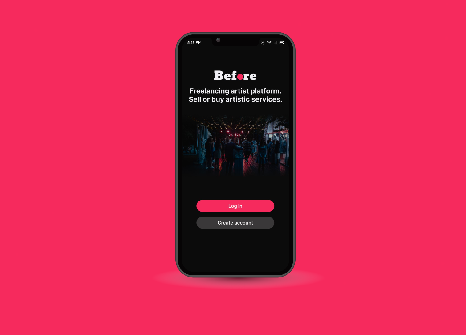
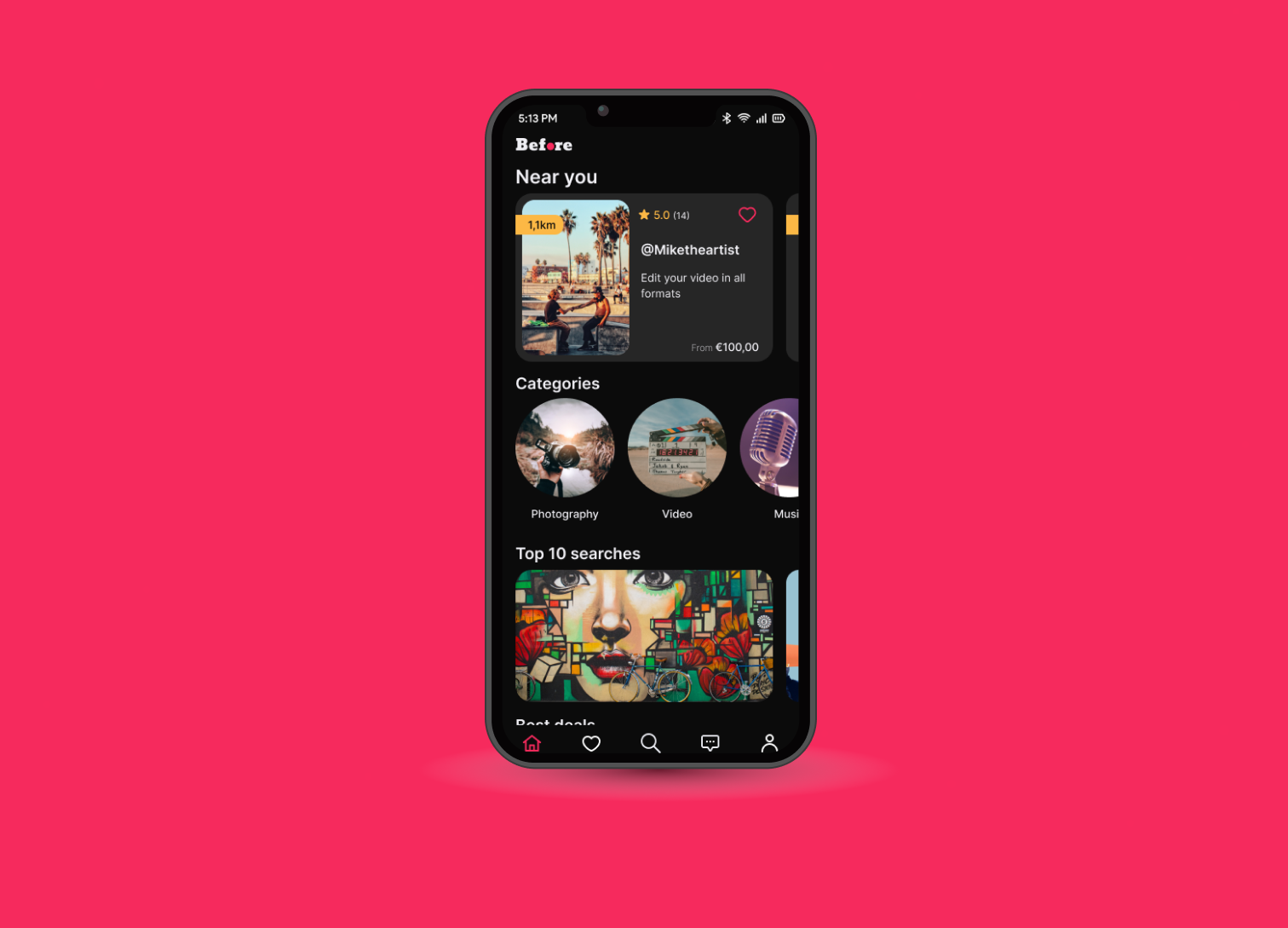
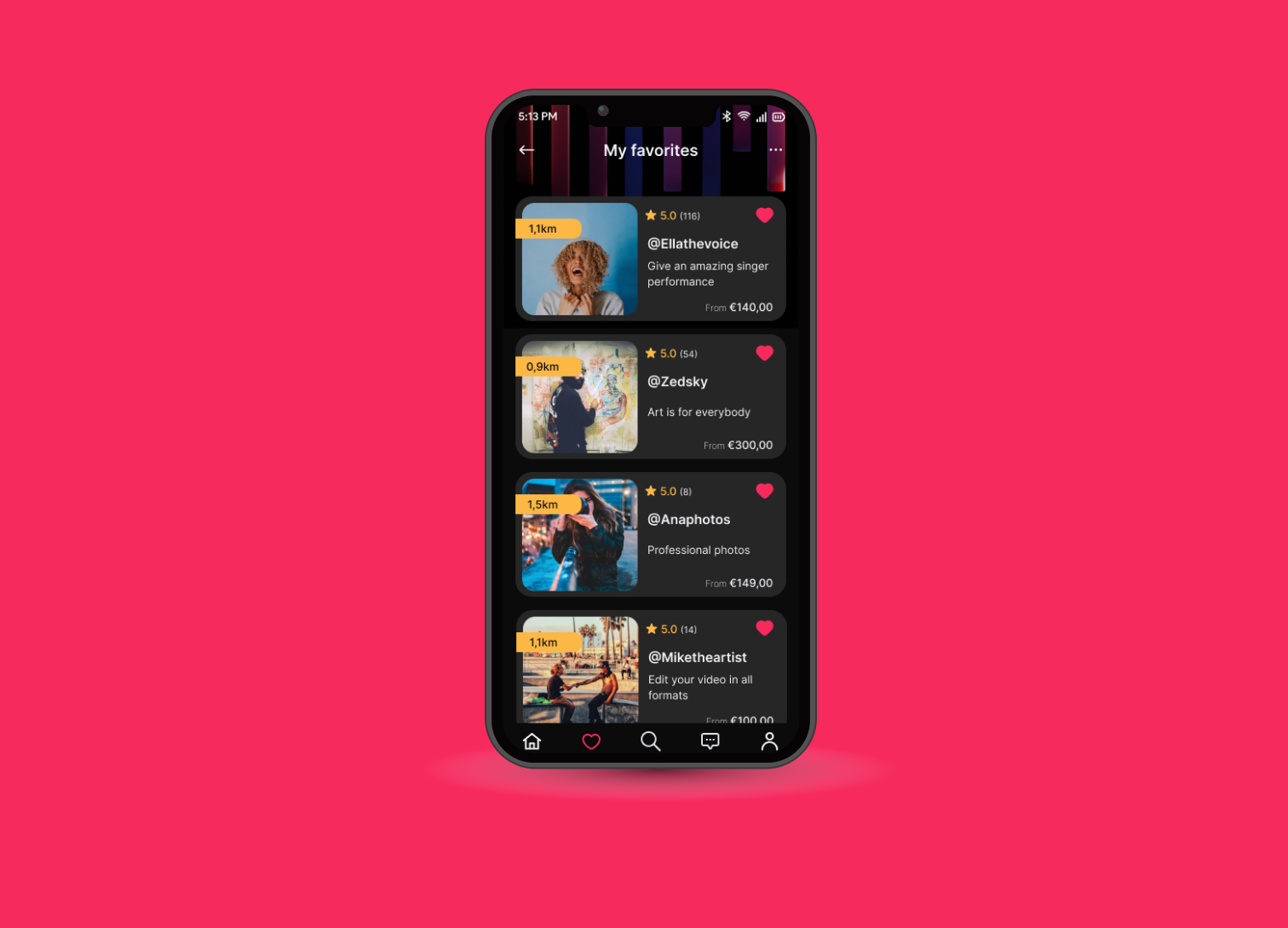
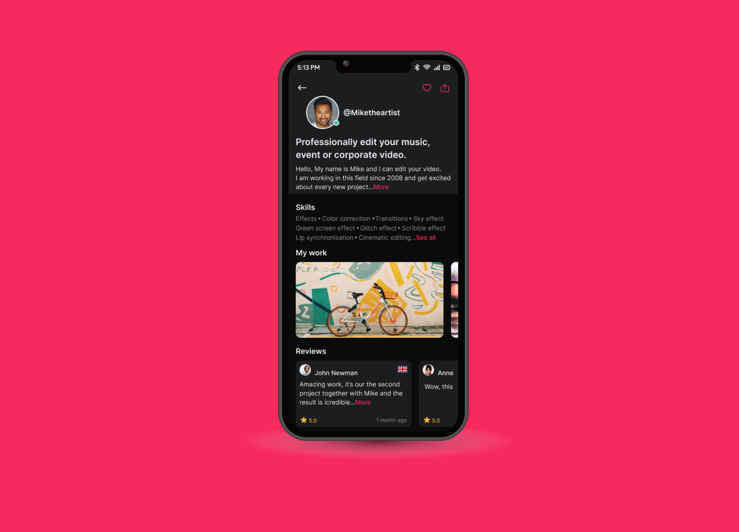
After we had both the structure and the wireframes I proceeded with putting it all together and designing the final UI
View interactive prototype

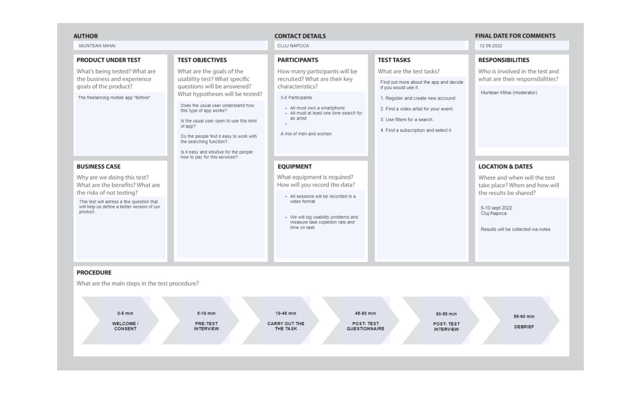
Usability testing was conducted with real users to validate my design decisions before creating the final form of the hi-fi screens and beginning of the development’’As a result, after the first usability test, the prototype changed in a proportion of 50% and the final result got tested again successfully regarding the requested tasks.